
Written by:
Mike Coughlan
If you want to be recognised, trusted and followed, brand consistency is how to achieve it. Brands that do this well are the ones that are confident in who they are. They know how they sound, look or act in a number of ways and situations. They then enforce these principles no matter how they’re found. We see brands doing this well every day but we don’t always notice. We’ve been keeping an eye out for the ones we think are doing brand consistency well:
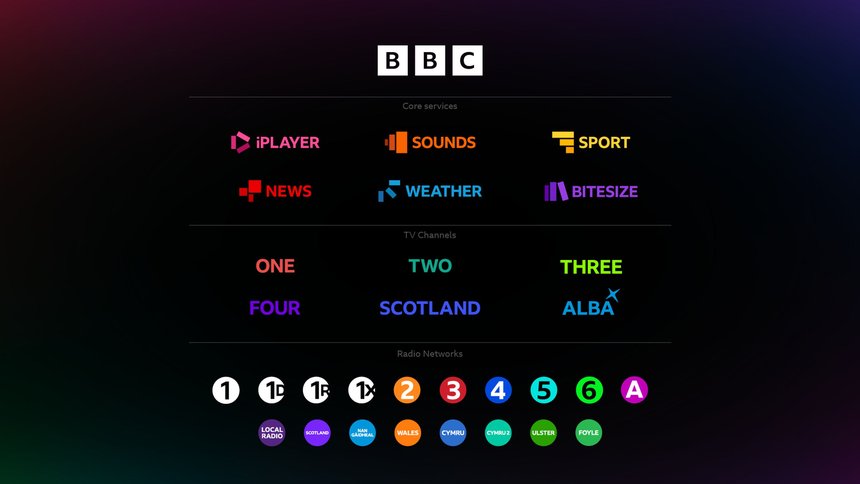
The BBC are a great example of a brand that have multiple sub brands but still maintain consistency across all of them. With so many areas and target audiences, it can be difficult to establish a brand identity that works well across the board, but the BBC manages this through iconography and colour. Each brand identity is its own entity but still looks like they're from the same family. Although each sub brand has its own nuances in tone of voice, the heart of the visual identity remains the same and the tone of voice has a strong guide for each of their target audiences or needs.
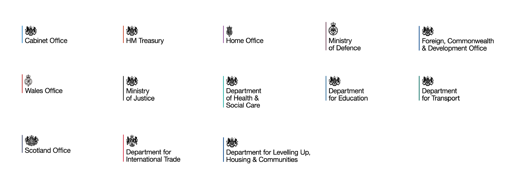
HM Government is another example of where no matter which sector of the brand is being presented it is immediately recognisable as being part of HM Government. This is achieved through the consistent layout and font of each logo, the only change is the colour of the line and the icon. Their comprehensive brand guidelines cover visual identity across an array of uses from print to digital. Their brand guidelines are the ultimate guide to creating anything visual for their brand.
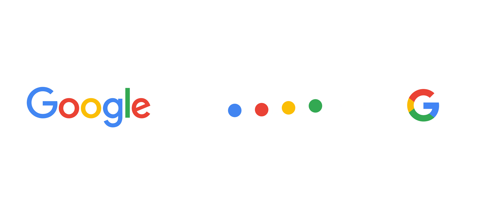
Google have refined and reflected on their brand over the years but have kept the same few colours that we all know to be Google. This consistency has cemented the brand in our minds despite tweaks and refinement through time to create a softer brand identity. This strong sense of brand image can be seen consistently across all of Google’s products.
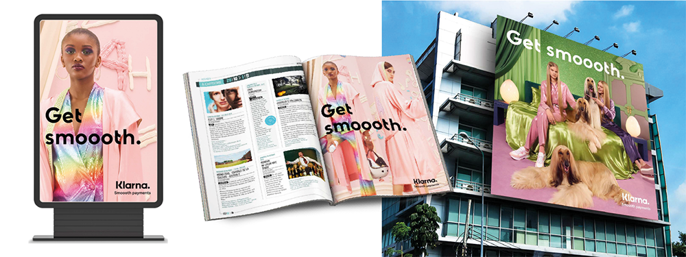
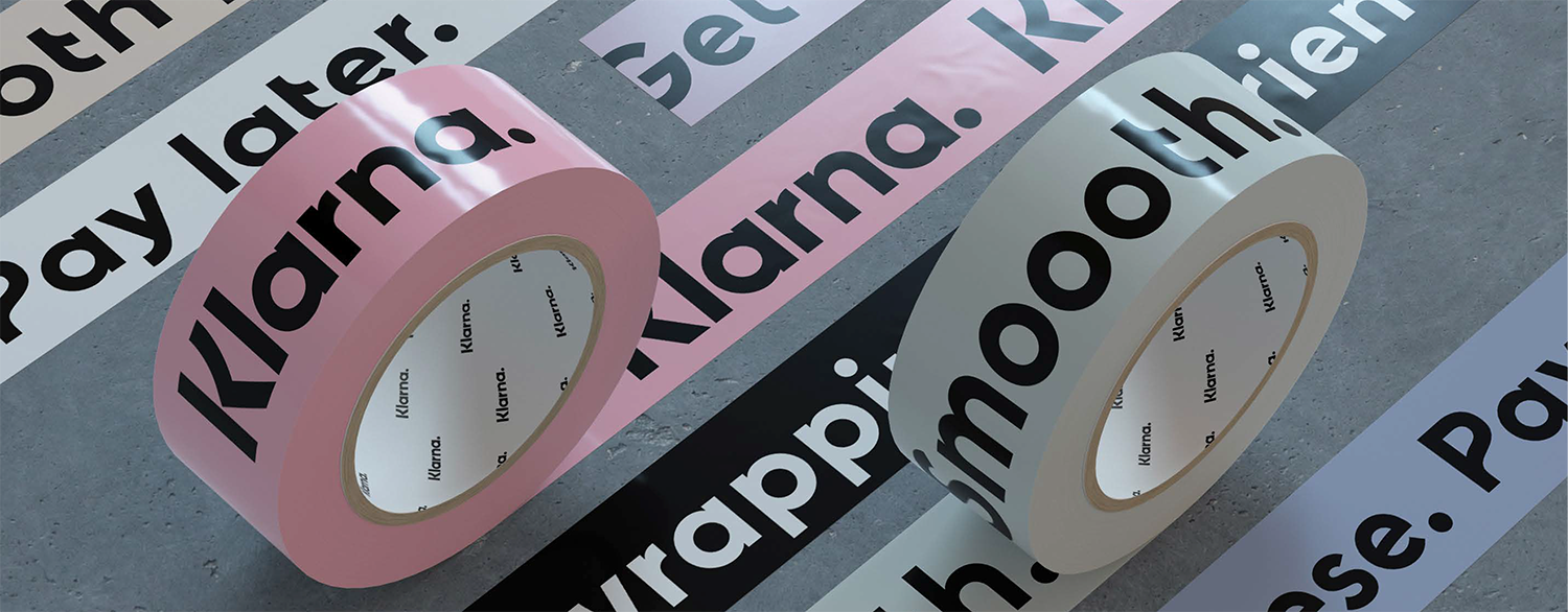
If you're looking for brand that is confident in who it is, Klarna is a great example. Klarna has a strong visual identity and sense of self that is presented consistently across various places it is seen. As a primarily digital brand, that doesn't mean Klarna only needs to look sleek on devices but wherever presented in print also. Their comprehensive brand guidelines showcase how the brand looks wherever it is used, including when used as part of a brand lock up alongside another brand as well as layout examples.
Get in touch for help establishing consistency in your brand.
Or download our brand consistency checklist to begin the process of aligning your brand.
Roger Genis
Amari West London
Linsey Briggs
CEF

Steve Hudson
Howarth Timber

Hannah Sherriff
Mainline

West Midlands Safari Park

FREE advice, insights and good vibes only - it's a no spam zone over here!
Unit 6, Maisies Way
South Normanton
Derbyshire
DE55 2DS
T: 01623 625222