
Written by:
Mike Coughlan
It’s no secret that colours can evoke specific emotions and feelings. One study conducted by the University of Winnipeg found that people tend to associate blue with feelings of trust, security, and efficiency, making it a popular choice for corporate branding. A separate study by the University of California found that people perceive warmer colours like red and yellow as more attention-grabbing and stimulating, which can be useful for brands looking to create a sense of urgency or excitement in their marketing campaigns.
The key here is to strategically incorporate colour into your designs and giving more thought to exactly what you want to convey with colours, can influence your audience's perception of your brand, enhancing the effectiveness of your marketing campaigns.

Spotify's use of bright green is meant to evoke feelings of energy and positivity, as well as to represent growth and harmony. This colour is also used to represent the brand's focus on sustainability and environmentalism.
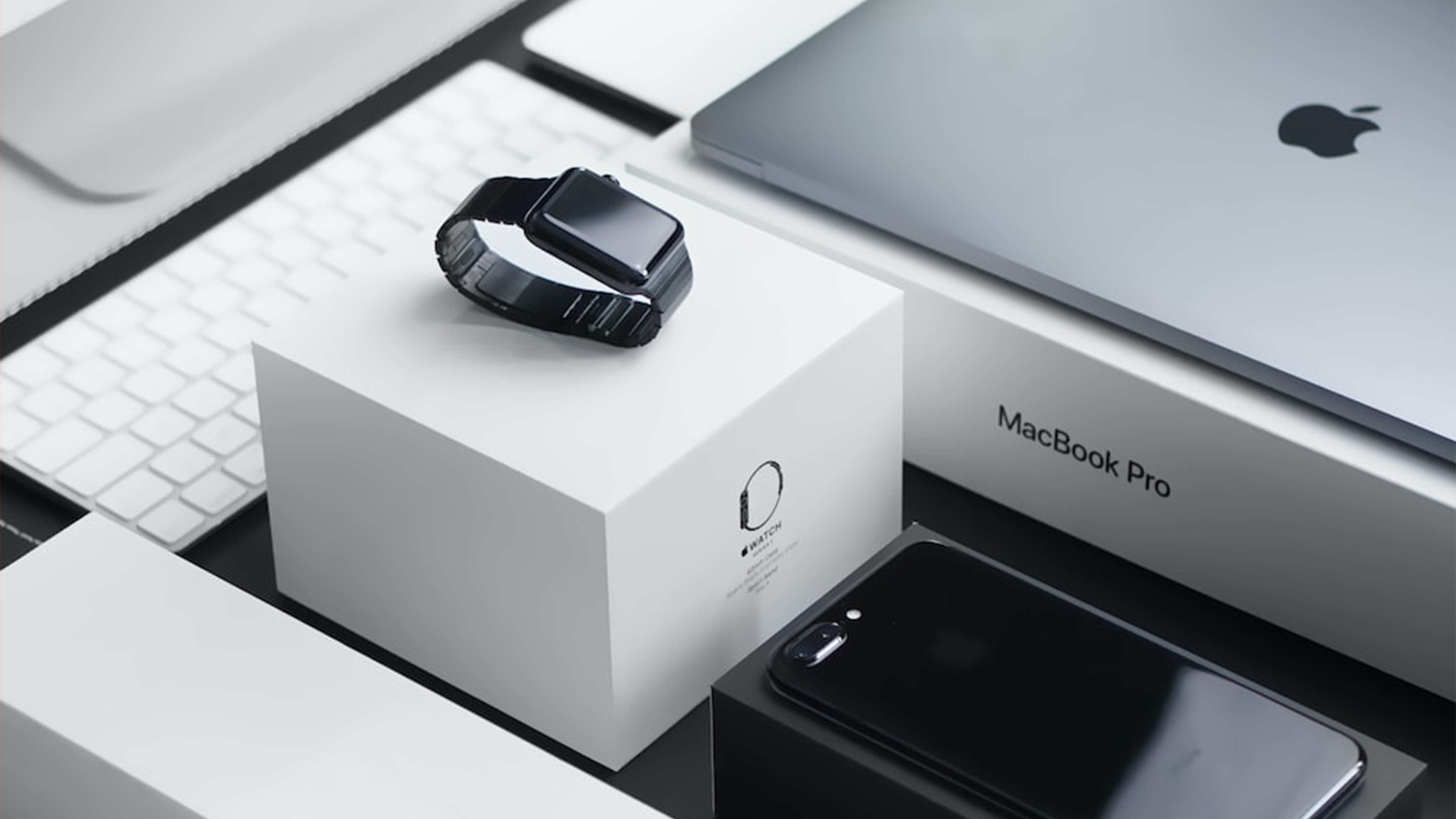
Apple has been using a sleek, minimalist design for its products for many years, and its use of white and silver colours reinforces this brand image. White is associated with purity, simplicity, and sophistication, while silver represents modernity and innovation.
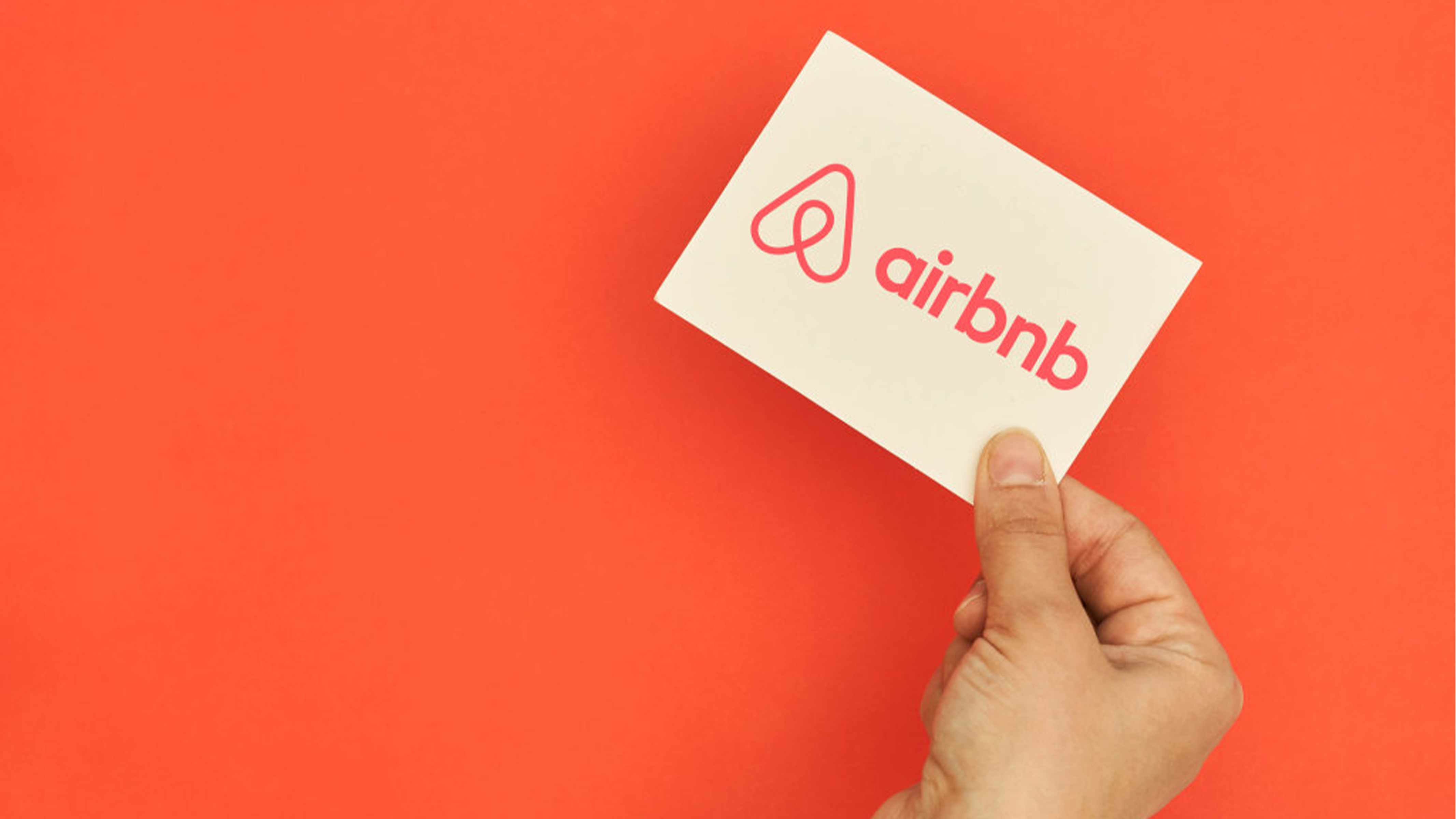
Airbnb's use of a coral colour for its logo and branding is meant to convey warmth, hospitality, and friendliness. This colour is also used to represent the brand's commitment to inclusivity and diversity.
But it's not just about choosing the right colour; it's also about utilising it in the right ways. For example, using a bright yellow background can make black text appear more readable, and using a bold, contrasting colour for your call-to-action can make it more noticeable and increase conversion rates. This can be utilised in both digital and print design and taking the time to consider how your colours appear in both mediums is vital for the success of your brand design.
At Summit Creative, we have the eye for style and a professional skill set to help you make the most of colour in your digital and print marketing campaigns. Colour is always at the forefront of design within our team as we have the experience to understand what is and isn't the right choice for your brand. Don't settle for anything less than the best. Choose Summit Creative as your printing partner and experience the benefits of working with a company that is passionate about delivering high-quality printing solutions and design services to businesses like your own! Get in touch
Roger Genis
Amari West London
Linsey Briggs
CEF

Steve Hudson
Howarth Timber

Hannah Sherriff
Mainline

West Midlands Safari Park

FREE advice, insights and good vibes only - it's a no spam zone over here!
Unit 6, Maisies Way
South Normanton
Derbyshire
DE55 2DS
T: 01623 625222