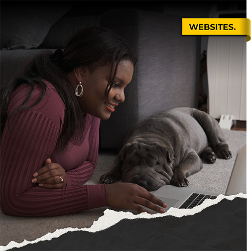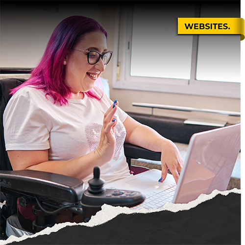

With more people accessing the internet via mobile devices, having a fixed website design that simply looks great on a desktop is no longer enough.
Written by:
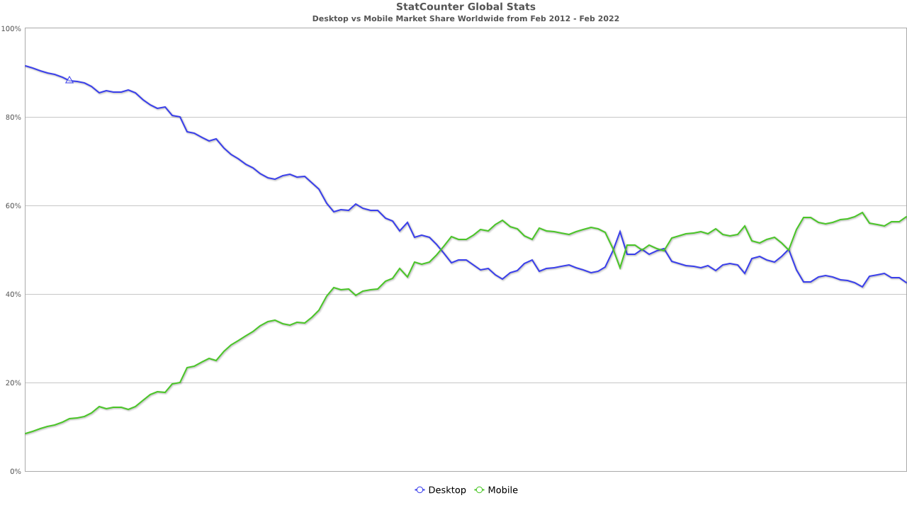
Statistics show that over half of the traffic on the world wide web is now accessed through a mobile screen instead of a desktop. We began to see this shift in late 2016 when more people began accessing the web ‘on the go’.
59% of the internet traffic is accessed through mobile devices.
 Source
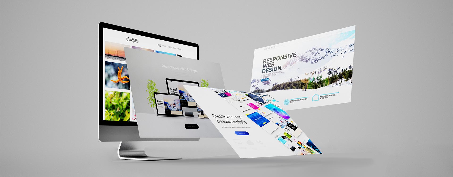
With this in mind it is no longer okay to just throw your content on a static html page and expect it to look good on all devices. Responsive web design ensures that your content adapts to the different screen sizes, not just on desktop but also mobiles and tablets. This in turn creates a better user experience and generates more return on your web development investment.
Responsive Programming Language Explained
HTML, CSS and Media Queries
The underlying foundations of responsive design is achieved through two programming languages; HTML and CSS. HTML refers to the different elements on a web page, such as a heading, an image or a link. CSS is used to style those elements, for example the colour, font size, width and so much more.
Media queries is a process within CSS which allows you to create breakpoints and define a set of different styles to apply on specific screen sizes. What is a breakpoint you ask? A breakpoint is a pixel value at which point you would like to apply a style. For example you may want to change the font size of a heading when the screen reaches a breakpoint of 360px wide (a common mobile screen size). Using the capabilities of media queries and css, you can help create a more fluid layout which can adapt to different devices.
Size Matters

Common screen sizes
Although most devices come in various different resolutions, here are the most common ones in pixels.
The best approach
When thinking about the design of your website you may want to consider a mobile first approach as this would cater to the majority of your audience. Remember over half of web content is viewed on phones. Once your mobile layout is looking slick it is a lot easier to adapt it to bigger screens. Decide on what breakpoints you want to use for your layout, you may want to cater to specific device models or even consider portrait and landscape views. And lastly and most importantly remember to test test test!
Is your website responsive?
At Summit Creative we understand the importance of creating the best user experience, no matter what device you are using. If you need help in rebranding or making your website responsive, contact one of our website consultants here. And for more resources on responsive brand design take a look at our latest webinar on Brand Design
Roger Genis
Amari West London
Linsey Briggs
CEF

Steve Hudson
Howarth Timber

Hannah Sherriff
Mainline

West Midlands Safari Park

FREE advice, insights and good vibes only - it's a no spam zone over here!
Unit 6, Maisies Way
South Normanton
Derbyshire
DE55 2DS
T: 01623 625222