Arrowhead Rockdrill Rebrand
Keeping the essence of Arrowhead's current brand but bringing it up-to-date.

The Brief
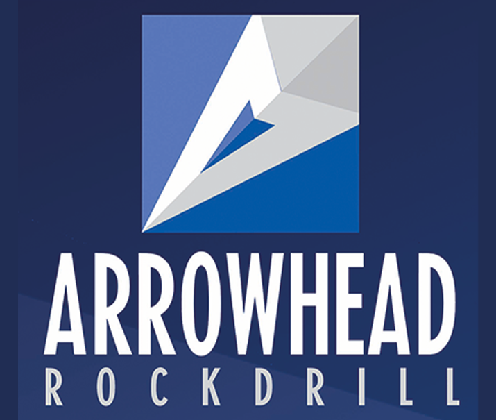
Arrowhead Rockdrill wanted to update their brand whilst still keeping the elements of the logo that their customers have come to know and trust. As a global and well-recognised brand in their field, Arrowhead wanted to ensure brand consistency across all re-sellers around the world.
Our Approach.
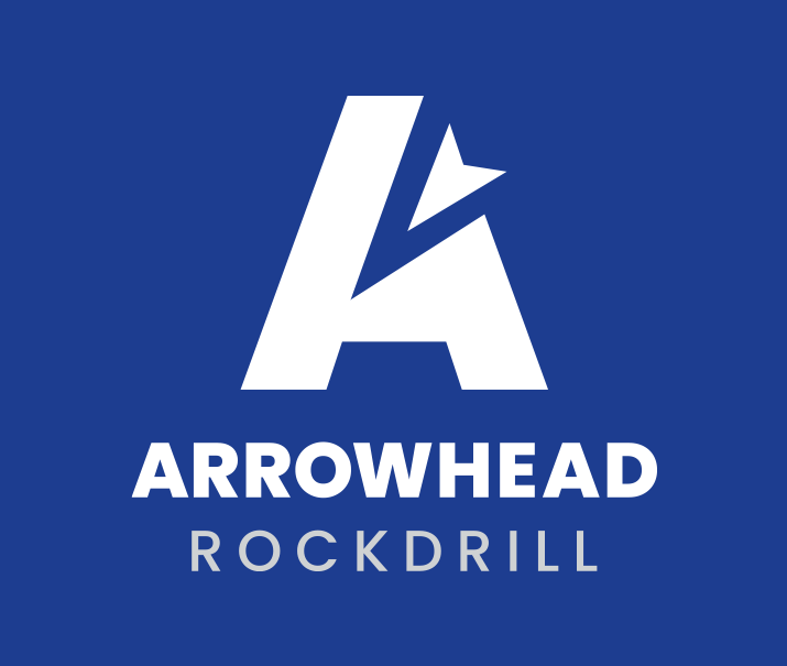
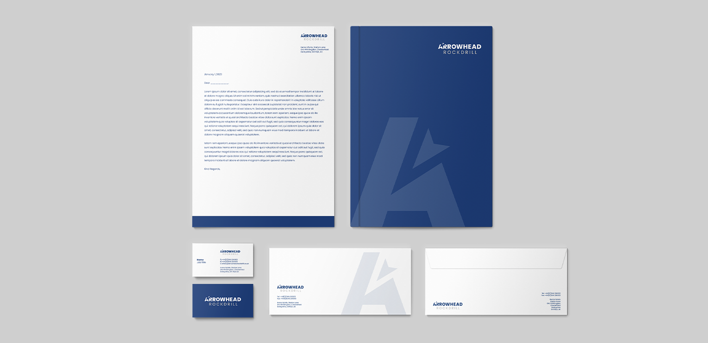
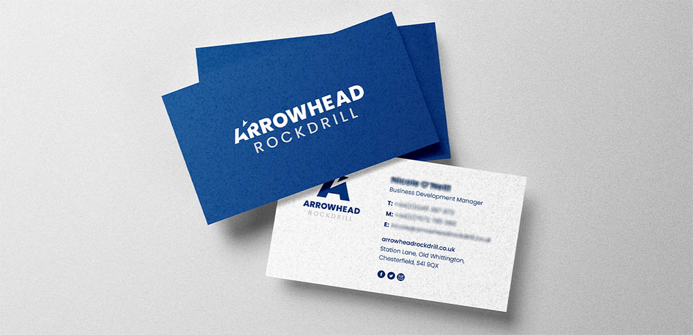
We reworked their existing logo into a more contemporary version, retaining their signature blue but simplifying their arrow head graphic into a logotype which incorporates the same shape. We utilised negative space to give the impression of the arrow head piercing the letter 'A'. We complimented the new graphic with a bold sans-serif typeface to symbolise the tough nature of their products. In addition to the reworked logo, we developed a series of responsive versions, for use at various sizes, eliminating the previous logos issues with readability.
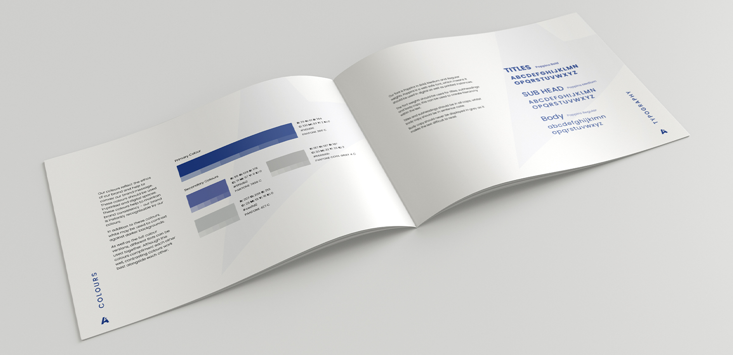
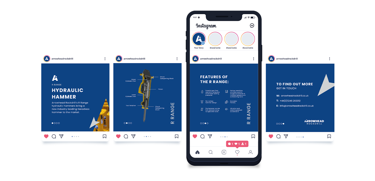
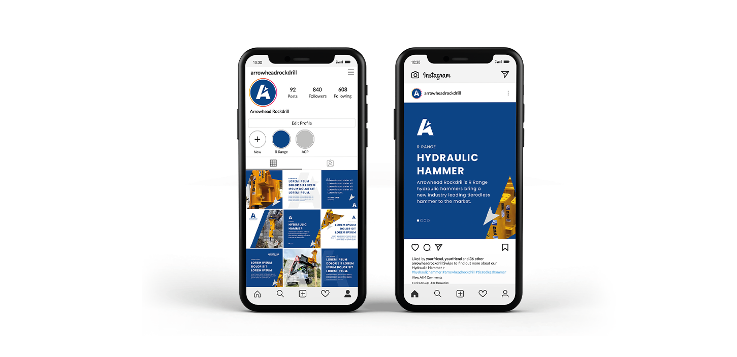
To enable brand consistency across Arrowhead's International resellers we developed in-depth brand guidelines, covering everything from fonts and colours to social media templates and printed materials designs.
The Outcome.
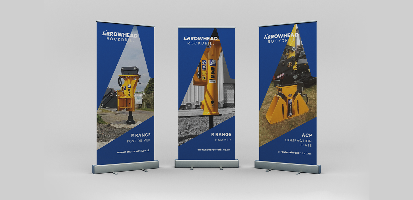
A cohesive brand that is consistently recognisable with a print and web presence around the world.
We're all about collaboration and inclusivity, so we love to work closely with our clients - but not everyone wants that and we totally get that. We'll work in a way that suits you whilst ensuring that we're on the same page every step of the way - from our first discovery session right through to project completion.